For the complete documentation index, see llms.txt. This page is also available as Markdown.

🧰Brand kit (workspace-wide)

Set your workspace look once in the Dapta Forms brand kit: logo, client logos, colors, typeface and controls. New forms start with it, and you can apply it to existing forms in bulk, with a per-form U

The brand kit is your workspace's default look: a logo, a list of client logos, three colors, a typeface and the shape of controls. Every new form in the workspace starts with it, and you can push it to forms you already have with one click. It lives under Account settings, not inside a form, so it applies to the whole workspace.

Only workspace admins and owners can edit the brand kit. Members can open the page but see it read-only, with the note Only an admin or owner can edit the brand kit.


Step 1: Click your profile button at the bottom of the left menu and choose Brand kit under Account settings (you can also click Brand kit in the sub-navigation of any Account settings page). The Managing: chip confirms which workspace you are editing; switch workspaces from the switcher at the top of the left menu if you need another one.

The Brand kit page under Account settings: sub-navigation with Workspaces, Brand kit, Notifications and Public page; sections for Logo, Client logos, Colors and Typography; and a Preview card on the right
The Brand kit page. Nothing is set yet, so every form keeps its own design.

Step 2: Fill in the parts of the kit you want to standardize. Anything you leave empty stays Not set: each form keeps its own, so you can standardize just the logo, or just the colors, without touching the rest. The Preview card on the right updates as you edit.

The brand kit with a Logo URL filled in and an orange Accent color picked; the Preview card shows the logo and an orange Continue button; the Save brand kit button is highlighted
A logo URL and an accent color set. The Preview reflects both. Click Save brand kit to store the kit.
Section
Fields
Notes

Logo

Logo URL

Shown on covers and headers unless a form sets its own logo.

Client logos

Add logo rows with Client name and image URL, Remove

The "trusted by" marquee on covers. See Client logos marquee.

Colors

Background, Text, Accent

Click a swatch to pick a preset or type a hex. A contrast readout appears next to Text and Accent. Setting a Background locks the light/dark theme of the forms the kit is applied to (they stop following the visitor's light or dark setting).

Typography

Typeface

The typeface forms render with. Pick one of the bundled faces, or Your own to enter a Font name and a Font file URL (.woff2) that you host yourself. Once a typeface is set, a Clear link next to it returns it to Not set.

Controls

Corners (Sharp / Soft / Round), Button (Solid / Outline / Soft)

Corner radius and button style. Each has its own Clear link once set.

Step 3: Click Save brand kit. A Brand kit saved. confirmation and a Last saved timestamp appear next to the button. From now on, every new form created in this workspace starts with these values.

⚠️ Note: Saving the kit does not change forms that already exist. Each form keeps a copy of the design it was created with. To update existing forms, use Apply to existing forms below.


Step 4: To push the kit to forms you already have, scroll to Apply to existing forms. Tick the forms that should adopt the kit (or use Select all / Clear selection), then click Apply to selected (n).

The Apply to existing forms section with one form, Product fit quiz, ticked and the Apply to selected (1) button highlighted
Pick the forms, then click Apply to selected. The warning above the list is real: applying updates the published version immediately.
⚠️ Note: Applying updates the selected forms immediately, including their published version. Respondents see the new look on their next visit, with no extra Publish step. Fields the kit does not set are left as each form has them.


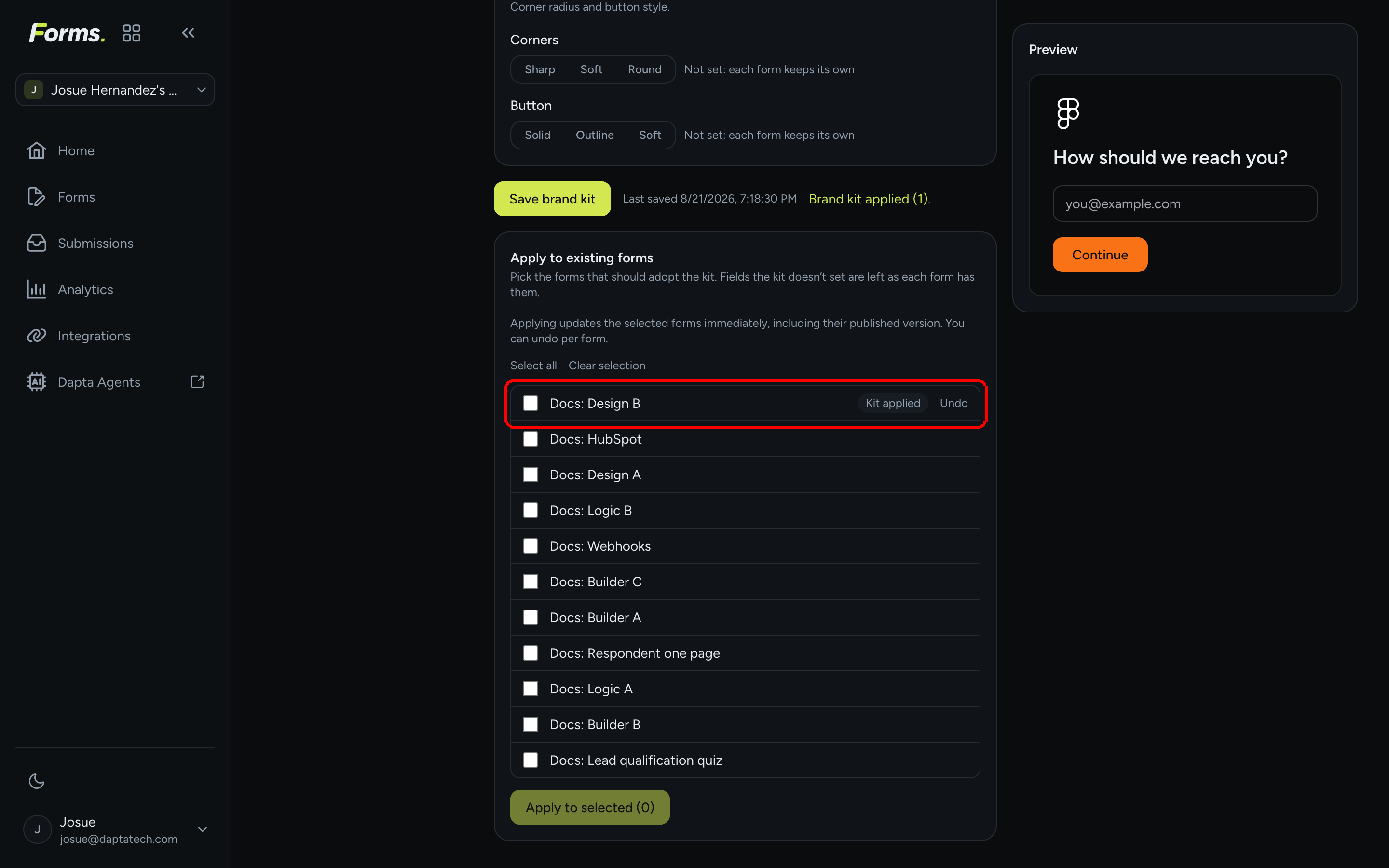
Step 5: After applying, a Brand kit applied (n). confirmation shows, each affected form moves to the top of the list with a Kit applied badge, and an Undo link appears next to it. Click Undo to put that form back exactly as it was (confirmation: Brand kit apply undone.).

The form list after applying: Product fit quiz at the top with a Kit applied badge and an Undo link
Kit applied marks the forms that took the kit. Undo reverts one form at a time.

Open one of the forms to see the result: the kit's logo now sits on the cover and the accent color drives the buttons and highlights.

The published cover of the form after the kit was applied: the kit's logo at the top and an orange Start button in the kit's accent color
The same form after Apply to selected: the kit's logo and orange accent replaced the form's own.

How the kit and individual forms relate

  • New forms start with the kit. When you create a form, its design is filled from the kit. You can then change anything in that form's Design panel; the form is not tied to the kit afterwards.

  • Editing the kit later does not ripple. Existing forms keep what they have until you use Apply to existing forms.

  • Apply only overwrites what the kit sets. A kit with only a logo and an accent leaves every form's background, typeface and controls untouched.

  • Undo is per form and restores the design that form had right before the apply.

  • No forms yet? The section reads No forms yet. The kit will style your first one automatically.

What's next

Last updated