For the complete documentation index, see llms.txt. This page is also available as Markdown.

🏠Dashboard tour

A tour of the Dapta Forms dashboard: the Home tiles and shortcuts, the left menu (Home, Forms, Submissions, Analytics, Integrations, Dapta Agents), the profile menu, the app switcher, the workspace sw

Once you are signed in, everything in Dapta Forms is reachable from the left menu and the Home screen. This page walks through each control so you know where things live before you start building.


Home

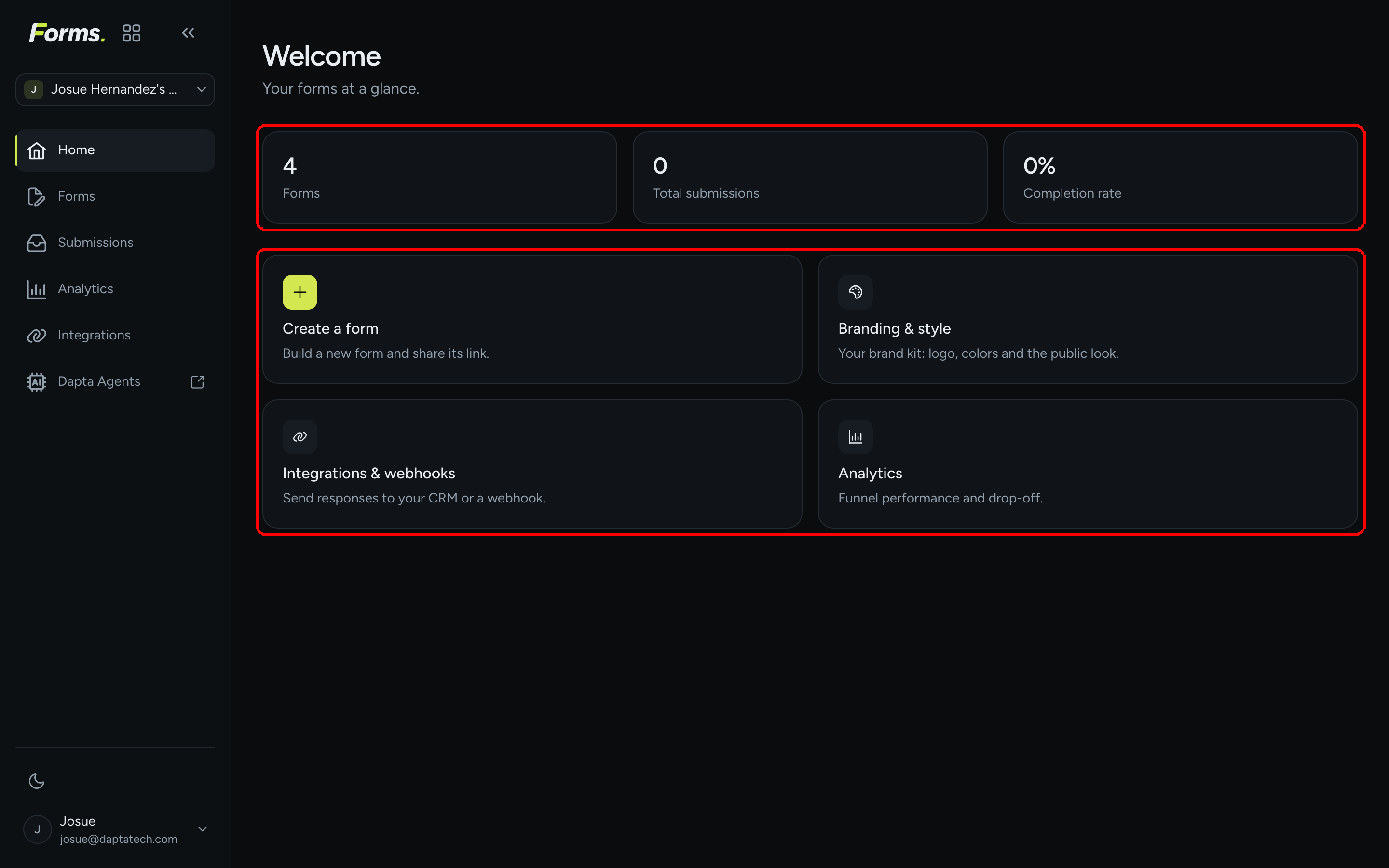
Home opens every time you sign in. It has two parts: three stat tiles and four shortcut cards.

The Home screen with the three stat tiles Forms, Total submissions and Completion rate and the four shortcut cards highlighted
Home: stat tiles on top, shortcut cards below. Every tile and card is a link.
Element
What it shows or does

Forms tile

How many forms the workspace has. Click to open the forms list.

Total submissions tile

Submissions across all forms in the workspace. Click to open the Submissions picker.

Completion rate tile

Submissions divided by starts, across all forms. Click to open Analytics.

Create a form card

Opens the Create a new form dialog (name + layout).

Branding & style card

Opens the workspace Brand kit: logo, colors and the public look.

Integrations & webhooks card

Opens Connections (HubSpot, Calendly) and the list of webhooks.

Analytics card

Opens the Analytics picker: funnel performance and drop-off per form.

πŸ’‘ Tip: When your public page is published (profile menu β†’ Public page), Home also shows a Your public page box with a copyable link to forms.dapta.ai/{account code}/{handle}.


The left menu

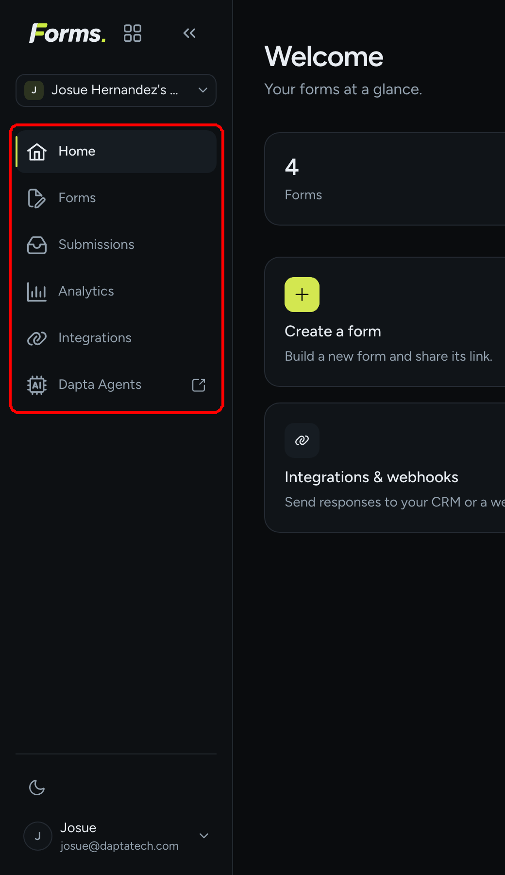
The left menu (the "rail") is the main navigation. It is the same on every page except the editor, where it collapses to icons to give the canvas more room.

The left menu with the six entries Home, Forms, Submissions, Analytics, Integrations and Dapta Agents highlighted
The six entries of the left menu. Dapta Agents opens the Dapta app in a new tab.
Entry
Where it goes

Home

The overview above.

Forms

The list of forms in the workspace, with Create form, and per-form actions: Edit, Submissions, Analytics, Connect, copy link, open form, and a menu with Duplicate and Delete.

Submissions

A picker: choose a form to see its responses, filter All, Completed or Partial, and Download CSV.

Analytics

A picker: choose a form to see Views, Starts, Submissions, Completion rate, Time to complete, trends and question-by-question drop-off.

Integrations

The Connections page (HubSpot, Calendly, Google Sheets marked Coming soon) plus the list of webhooks across your forms.

Dapta Agents

Opens app.dapta.ai in a new tab (note the external-link arrow).

The top of the rail holds the Forms wordmark, the app switcher and the workspace switcher. The bottom holds the theme toggle and your profile button. Each is described below.


App switcher

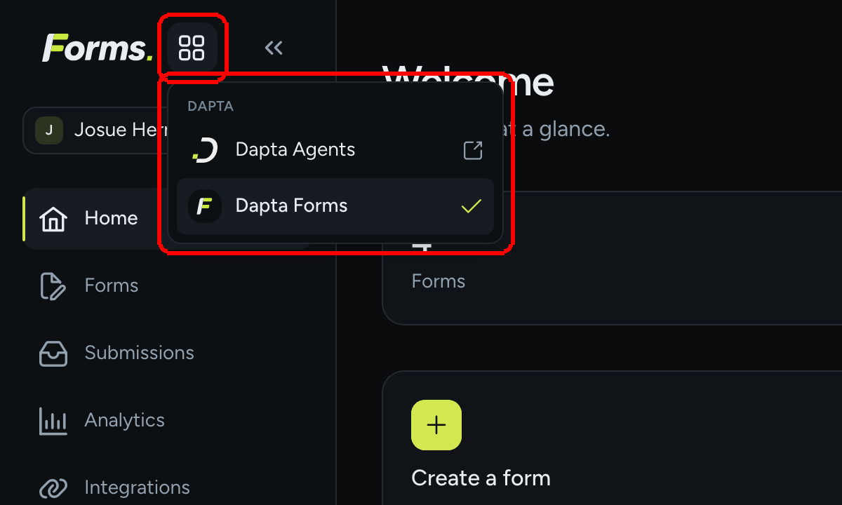
Step 1: Click the grid icon next to the Forms wordmark (its tooltip reads Switch product). A small menu titled Dapta lists the products: Dapta Agents (opens in a new tab) and Dapta Forms (the current one, with a check mark).

The app switcher open under the grid icon, listing Dapta Agents and Dapta Forms with a check mark on Dapta Forms
The app switcher. Use it to jump to the Dapta app without leaving your session.
Press Escape or click anywhere else to close it.


Workspace switcher

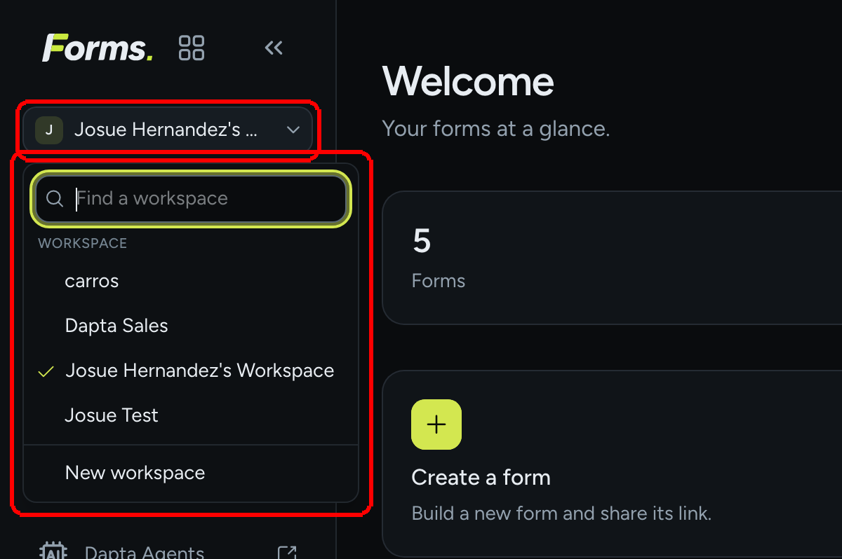
Step 2: Click the workspace name under the wordmark (the button with the initial tile and a chevron). The menu lists every workspace you belong to under the Workspace heading; the active one has a check mark. Pick another one to switch: the page reloads inside that workspace, and everything (forms, submissions, brand kit, integrations) now refers to it.

The workspace switcher open, showing the Find a workspace search box, a list of workspaces with the current one checked, and New workspace at the bottom
The workspace switcher. Find a workspace filters the list; New workspace creates one.
  • Find a workspace appears when you have six or more workspaces and filters the list as you type. If nothing matches you see No workspace matches that.

  • Workspaces you were invited to but have not opened yet carry an Invited badge. Opening one accepts the invitation.

  • New workspace opens a dialog with one field, Name (up to 80 characters), and creates a separate space with its own forms, members, branding and integrations. You become its owner.


Profile menu

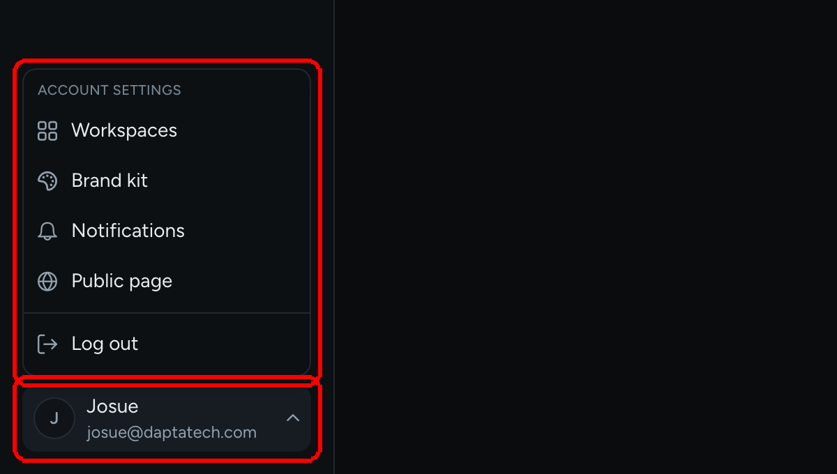
Step 3: Click your name and email at the bottom of the rail (the button is labeled Account menu). The menu is headed Account settings and links to the four account pages, then Log out.

The profile menu open above the profile button, listing Workspaces, Brand kit, Notifications, Public page and Log out
The profile menu: account settings plus Log out.
Item
What it opens

Workspaces

Every workspace you belong to, with Open and Manage (members, invitations, rename, workspace ID).

Brand kit

The workspace look: logo, client logos, colors, typography and controls. New forms start with it.

Notifications

The two email templates sent on submission: New submission notice and Respondent confirmation.

Public page

Your page at forms.dapta.ai/{account code}/{handle} listing the forms you want people to find, plus your identity (name, email, handle, account code).

Log out

Ends your Forms session and the shared Dapta session. See Sign in.


Theme toggle

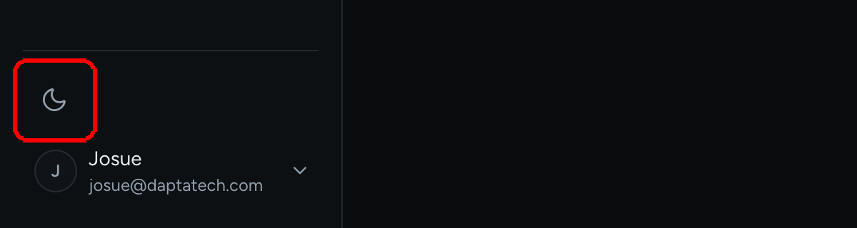
Just above the profile button sits a single icon button that switches the admin between Dark and Light. Its accessible name tells you the current theme and what a click does, for example Theme: Dark: Switch to light. The choice is remembered in this browser.

The bottom of the left menu with the moon-shaped theme toggle highlighted above the profile button
The theme toggle. One click flips the admin between dark and light.
πŸ’‘ Tip: The theme toggle only changes the admin. Your public forms follow each visitor's own light or dark setting unless you set a background color in Design.


Collapsing the rail

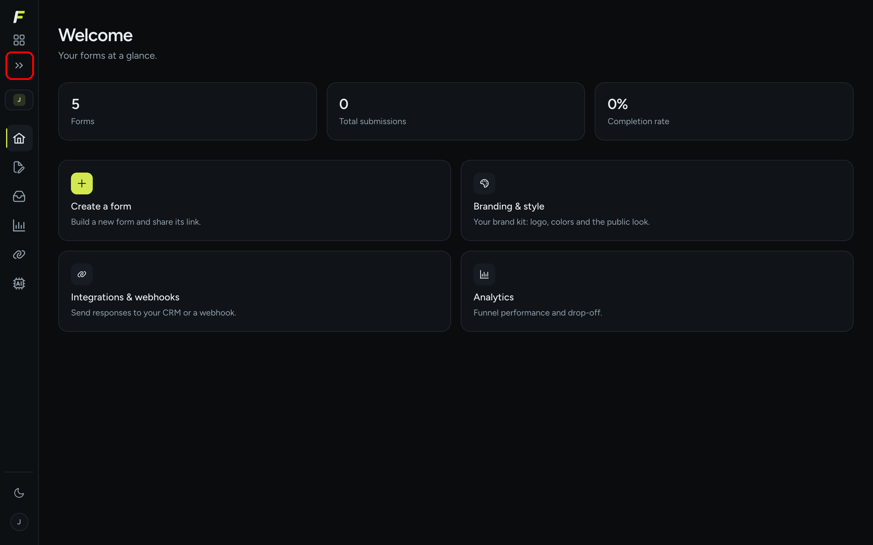
Step 4: Click the double chevron in the top-right corner of the rail (Collapse sidebar). The menu shrinks to 64 px of icons; hover an icon to see its name. Click the chevron again (Expand sidebar) to bring the labels back. Your preference is remembered.

The dashboard with the left menu collapsed to icons and the Expand sidebar chevron highlighted
The collapsed rail. The chevron at the top expands it again.

The editor always collapses the rail for you, so the question list, canvas and settings get the full width. On narrow screens the rail becomes a hamburger button (Open navigation) that opens a drawer.

What's next

Last updated